Guess the fat kids always win and be the star of the show in these commercial.
Another one from Melody, still very funny and amusing when the mother sings for her child!
Thursday 30 August 2007
Melody Tunes TV 2
Melody Tunes
This is one of the commercials on TV for an Egyptian music channel.
The kid was drawing his fat brother so the fat kid enjoyed seeing his brother smacked by his mother.
Hilarious, to promote the launch of the new music channel all in English and the good part is using an Egyptian accent to talk English.
Friday 24 August 2007
Beko, Very Quite

I find this advert quite amusing, I didn't understand at first it took me awhile. The background is so quite and the colors used in the shot really shows how silent the room is.
Here, I'm amazed how can some colors represents action or silent. Then your eyes notice that piece of carpet with striking lines and again the silence again. Your eyes will even notice the vacuum cleaner the star of the advert. How it is shaped like a music note and then you understand the whole advert for it.
The small print says, "Beko is very quite".
It is really quite and a good advert I would say.
Thursday 23 August 2007
KLM

This is a very interesting work of design promoting an airline company, KLM the royal dutch airline.
We see the English alphabet then a crown in the middle with missing words higher than the letters. When you check the missing letters they are; K, L & M. The letters of the airline company and the crown represent how Royal the airline is that the letters turned into a crown.
Very clever piece of work.
Heinz Baked Beans

I'm sure most people saw this ad by Heinz Baked Beans. That was out for the Christmas season. What we have here is a Santa Clause boxers shorts, a man standing how just had Heinz Baked Beans. Showing you how did all the Santas got alerted after the man had his beans, the dead Santa is my favourite.
It shows that how good the beans tasted depends how powerful and smelly his fart was.
It shows that how good the beans tasted depends how powerful and smelly his fart was.
Tuesday 21 August 2007
Wild Cats

That was at my friend's Hasan house, who likes to collect things and arrange them in a very weird twisted way.
Well, I like seeing bizarre things in life, shaped and designed in a models. Its quite funny.
Well, I like seeing bizarre things in life, shaped and designed in a models. Its quite funny.
Monday 20 August 2007
Adidas


When I was talking about Arabic and English translation for most of the brands we see in the Middle East. I think this poster for Adidas really worked, how the developed the Arabic typography to be similar as the Latin and did not change the tone of voice of it.
Good work!
Sale

"Sale up to 75% for stylist and fashionable maternity clothes. Unbelievable prices only at B Heart."
That's the translation for the ad in Kuwait. I think the poster says it all, for not showing the letter "S" for Sale but showing it as a pregnant women tummy. It made me smile.
Sunday 19 August 2007
Warba

Warba Insurance Company in Kuwait. As I have just posted previously quite a similar ad which it was copied from this one; the original ad.
I think this ad works better, its well communicated, strong, clean and clear. In my opinion, bandage does not have to be pixeled because it will lose its impact, and that is the message all about.
The advertising is about, online insurance.
I think this ad works better, its well communicated, strong, clean and clear. In my opinion, bandage does not have to be pixeled because it will lose its impact, and that is the message all about.
The advertising is about, online insurance.
Tea bags

A model which has a “tea bag” in his mouth. I am sure that the designer had no idea what tea bagging was. Who are they targeting ? Stupid people who eat tea bags?
So the concept is, its really good you will eat every part of it. Fine, nice thought but still execution sucks which took everything down the drain. And blue is not your color for tea, I would use white if I am running away from hot colors!! If you did not notice that the packaging and the background is the same shade of blue.
I vote this poster as the most hideous poster I've ever seen in my life, this company needs a new creative people to use! And what's with that DUDE, thinking he is so tough and a model!
I can't stop pointing how wrong this advert is, very wrong!
Saturday 18 August 2007
Computer

"Call us to solve your computer problems"
OK, there is the hand mouse and a blaster. This ad is taken from Saudi Arabia. Poor advertising, poor concept. Advertising in the Middle East isn't as advanced as it is in the West, so it might probably work there. I'm not exactly sure though about it. One thing I'm sure is, the wasted loads of money on it.
OK, there is the hand mouse and a blaster. This ad is taken from Saudi Arabia. Poor advertising, poor concept. Advertising in the Middle East isn't as advanced as it is in the West, so it might probably work there. I'm not exactly sure though about it. One thing I'm sure is, the wasted loads of money on it.
Friday 17 August 2007
English Language

A program for teaching basic English language for people. I find the ad isn't that well, the concept behind it didn't work with the model they used. Using an Asian guy, quite dressed good and then for some reason he couldn't read English?!
They could use a better model, maybe some nations who doesn't have a slightly idea about English but even though English language is spread widely around the globe. This ad was created in Oman but I find it quite insulting to use ethnic race; Asian . It would be better if they used an uncivilised person, someone from the jungle like Tarzan maybe?!
They could use a better model, maybe some nations who doesn't have a slightly idea about English but even though English language is spread widely around the globe. This ad was created in Oman but I find it quite insulting to use ethnic race; Asian . It would be better if they used an uncivilised person, someone from the jungle like Tarzan maybe?!
Wednesday 15 August 2007
Chemung Tech


"Yeah, ok, so I'm nuts. Big surprise to those who have made it this far without figuring that out. I use it for good instead of evil, though, and I done good, too.
I got myself in the Chicago Sun-Times, the Chicago Tribune (three times for anyone who is keeping score), the Elgin Daily Courier, the Rockford Register Star, the Northwest Herald, WTTW (Chicago's public television station for you out of district folks), and WGN the Superstation (c'mon, you had to have heard of that one).
Even got my stuff shown in a couple of galleries including Gallery 451 in Rockford, IL, Follies Gallery in Galena, IL, The Thompson Center in Chicago, IL, the Step Above Gallery in Washington D.C., and one in Toronto that I forgot the name of.
I also got invited to show in some colleges and, well heck, that ought to give you an idea of what I can do with a little bot of effort and a big ol' pocketful of the "you bet I cans." Now quit reading this and buy something. You've got better things to do, you know."
Images:
1. Signs of creative life: the door to Dale Sinderson's shop.
2. A quirky roadside surprise awaits you on route 173 in Harvard, Illinois. Artist Dale Sinderson's "Chemung Tech" is filled with his carvings, yard art and other unique creations.
3. Yard art: little green men, red snails and smirking cows.
4. The artists shows off his "mini town".
Gnomes, you no longer welcome in the backyard anymore, Dale's comics are conquering the garden. "Take me back home." They shout out! It's better to let you read about his biography from what he wrote than what I write about Dale Sinderson.
Chemung Tech website: http://www.chemungtech.com/
Bird House

Church of Ornithology. Faith-based avian housing. Right or left-leaning depending on how you look at it.
Another quite interesting piece of design by normal people that didn't attend to think as designers just to mark their religious opinion. Guess the birds are quite religious going to Sunday church.
Spam Filter

That gives us a good idea to design a mailbox in more interesting, creative idea. I like what the owner did for his mailbox.
Crown Fountain

Designed by Spanish sculptor Jaume Plensa, the Crown Fountain features two 50-foot high glass block towers at each end of a shallow reflecting pool. The towers are activated with changing video images and lights, and water cascades from the top of each. Anchoring the southwest corner of Millennium Park at Michigan Avenue and Monroe Streets, the Crown Fountain is a major addition to the city’s world-renowned public art collection. Inspired by the people of Chicago whose faces appear on the glass towers’ changing video images, this site-specific work creates both a unique meeting point and a dynamic space for silent reflection. Utilizing water, light, and glass, Plensa has created a bold statement that is sure to stimulate passers-by and invite them to enter and experience Millennium Park.
Excerpt from chicagotraveler.com
When we get influenced..


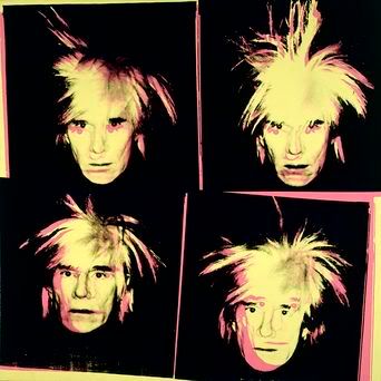
When I was wondering the corners of the world of Facebook, checked my cousin's profile pic. A design that embarks his face into different colors. Simple work, yet nice to the eyes. It shows that he got influenced by Pop Art movement; especially by Andy Warhol's work.
Andy Warhol was an American artist who become a central figure in the movement known as Pop Art. After a successful career as a commercial illustrator, Warhol became famous worldwide for his work as a painter; an avant-garde filmmaker, a record producer, an author and a public figure known for his presence in wildly diverse social circles that included bohemian street people, distinguished intellectuals, Hollywood celebrities and wealthy aristocrats.
He is generally acknowledged as one of the most influential artists of the twentieth century. Warhol's career had started in 1960s with creating paintings of famous American products such as Campbell's Soup Cans and Coca Cola.
His philosophy that expressed his affection for popular culture, and evidences an ambiguity of perspective that cuts across nearly all of the artist's statements about his own work.
He says: "What's great about this country is that America started the tradition where the richest consumers buy essentially the same things as the poorest. You can be watching TV and see Coca Cola, and you know that the President drinks Coca Cola, Liz Taylor drinks Coca Cola, and just think, you can drink Coca Cola, too. A coke is a coke and no amount of money can get you a better coke than the one the bum on the corner is drinking. All the cokes are the same and all the cokes are good. Liz Taylor knows it, the President knows it, the bum knows it, and you know it."
Question we raise here, we get influenced by such great inspired artists that came before us. These artists didn't have anything to inspire them except the social and culture they lived in. Can we as a young designers do something new that will mark us in history?
We will only have to wait and see.
Tuesday 14 August 2007
Latin & Arabic


Was brushing my teeth that night, something caught my eyes. An interesting typography for the toothpaste Crest that I used that night. The logo adapted to Arabic letters.
Brand in the Middle East are required by law to display both Latin and Arabic on their products. What is really interesting is to see how usual occidental brands are adapted into Arabic lettering. Its not always a success. Which I think its quite a brand problem and less a typographical problem.
The worst problem is when Arabic typography follow the Latin's in term of branding and style and its not always a well designed to be enough legible for Arabic. And some match perfectly the brand and style but even so not legible in Arabic or even in Latin. Say if it was Arabic branding then convert it to Latin's.
The best is when the Arabic versions are legible and still gives the style, brand and weight of the original Latin. For example the 7up logo.
Here are some examples I've collected.
Monday 13 August 2007
Belly Dancer Man
When I was wondering around You Tube, found this video.
He is dancing on a Morrocan song, but this guy have talent for the way he moves. He could be a belly dancer instructor.
I think this will be a perfect idea for a Belly Dancing School. That they can even teach the men to shake their bodies!!
Sunday 12 August 2007
Soul provider


Tom Kundig of Olson Sundberg Allen Architects knows what people want and he knows how to translate that into beautiful and inspired buildings. Kundig, who was recently awarded an Academy Award in Architecture from the American Academy of Arts and Letters, sees his work as collaborative, giving physical form to the ideas of his clients. He spoke with Open for Design about delivering on desires.
Open for Design interviewed him; asked him:
You have a reputation for being a listener when it comes to clients, craftspeople and fabricators. How do you deal with these different desires?
Tom Kundig: In a perfect world, I would say that my job as an architects is to make architecture out of what the client and the landscape wants, whereas my dad's generation was probably more like. "I'm the architect and I will make you architecture."
My desire is to pull from the landscape and pull from the client and create something that reflects all of these different things. So it's more of a collaboration.
So how do clients fir into your collaborative process?
The good clients understand that you are going to engage them and make decisions from there. You\re not going to let them design it or let the craftspeople build it; it's trying to orchestrate things into this rich, soulful building, if you're lucky.
I do feel uncomfortable with clients who just want me to make all of the decisions, because it's not my building - it's theirs. It's important for them to be present in the process.
I do feel uncomfortable with clients who just want me to make all of the decisions, because it's not my building - it's theirs. It's important for them to be present in the process.
Connecting to the environment is very important in your projects. How far do you take that?
The connection happens from the interior of the building all the way through the envelope of the building to the exterior and vice verse. There is clearly a thoughtfulness about how the interior works with the skin of the building and how the skin of the building works with the exterior of the building.
The full interview is on: http://openfordesign.msn.com/default.aspx?id=10city_kundig
Saturday 11 August 2007
Olympics

Check this Olympics welcoming by Paul Smith. "Happy to have the Olympics here...Paul Smith" Bless him. Isn't it better and I mean way much better than the logo they had chosen? The pink bricks? What is that about? Paying that much of ridiculous money for a designer to do some Lego bricks as a logo.
I know have been posting for Paul Smith a lot, what can I say; we are in love!
Get ready for the beach..

The ad I found online was really good, showing the summer collection for the latest runaway by Paul Smith.
Its a moving picture, not sure if it will work in the blog. Just click on the link to see it.
http://www.triomarketingventuresinc.com/newsletter/vol03/issue05/images/paulsmith_vol03_05.gif
Its a moving picture, not sure if it will work in the blog. Just click on the link to see it.
http://www.triomarketingventuresinc.com/newsletter/vol03/issue05/images/paulsmith_vol03_05.gif
Paul Smith


Paul Smith is an true Patriot English designer, with a very weird style fashion taste. Which I'm not complaining because I'm loving it! The fact that PS designs incorporate with everything is a good kind of marketing and advertising. Take for example the naked woman cuff links, was out last year. Though in the world cup fever, his designs went to a football and cuff links I couldn't find but similar to the above image but with a naked lady holding a football. One of man fantasies, I would believe. A mini cooper, English make, English design with some of Paul Smith colorful touch to it. A wallet that will be nice to have it as a gift.
HP sauce Paul Smith

Paul Smith has collaborated with HP Sauce to create a limited edition HP Sauce bottle.
The limited edition bottle, which features a take on the Paul Smith multi-stripe in varying shades of brown, will go on sale exclusively at Harrods as part of the ‘Truly British’ season.
Paul Smith explains. “As part of Harrods ‘Truly British’ season, I was invited to work with HP on an exclusive project. Customising the HP label was a great way for me to be part of this celebration of all things British.” Says Smith.
A great designer, one of the best.
Paul Smith explains. “As part of Harrods ‘Truly British’ season, I was invited to work with HP on an exclusive project. Customising the HP label was a great way for me to be part of this celebration of all things British.” Says Smith.
A great designer, one of the best.
Friday 10 August 2007
Gangsta 4 Life

Seen this idea before with Green Peace poster that I've posted few days ago. This poster is done by a student Jan Drewniak in Toronto. It says "Gangsta 4 Life; means when you're in, there's no way out."
Gangs are about the sense of loyalty and pride between the gang members have for their sets. Dying for one's gang is a part of life, a necessary evil and an honor.
I think the ad should focus that there is a way out, to offer hope, that you'd better offer it for them who got troubled in such things. And there are some non-profit organisations that would like to help the gangster who wants a new fresh life to start.
Give them hope, before killing them alive.
Veet

Two girls from Miami Ad School/Madrid did this ad. It believes that the ad was already done in Spanish before then got translated to a English.
It says: The marketing for Veet, a depilatory cream. Stickers are placed on campus, anywhere paint has peeled. Sticker reads "This is what happens to your skin when you wax."
I like it, but I also don't agree with it. Waxing may exfoliate skin, but it doesn't rip it off. So, for me, it's not highlighting a convincing benefit at all. Great on the idea and the execution, though. Very insightful and original.
Get a Girlfriend


So what we have here, is some losers; either playing video games or wasting their time with Lego or having a go cart race in their bedrooms.
Its quite funny campaign, the company tone of voice is attraction, seductive and sexy for the opposite sex. Its quite working here with their audience. Although we have always saw in their advert the macho man who actually uses Axe and the women are fighting over him. Why not show the men who doesn't use Axe deodorant the stinky loser men?
Conclusion: To "Get a Girlfriend" ... use Axe to attract the ladies!!
Wednesday 8 August 2007
Brits in Dubai offended by ad

Dubai: Britons are divided on whether a scrapped du advert that featured a man ordering fish and chips to the tune of their national anthem was offensive.
Telecommunications company du announced yesterday it was pulling off the radio advert after a Briton said it was "offensive".
The advert featured a man singing an order for fish and chips to the tune of 'God Save the Queen'. Although another Brit had been interviewed saying: "I think there are other radio adverts that stereotype on the grounds of race that are more offensive than this one was."
I haven't heard the advert myself, but the question is raising is; can a one call only from a Patriot British let the company withdraw this ad from the radio stations? And who is the target market when the creative brief was written?
Better leave it for Little Britain sketch comedy, so no one will complain!
Meridia

In this ad it shows some plates with leftover food. Then the announcer says "If you could leave just a little bit left-over after every meal..." Then he says "You could loose weight."
Meridia is a prescription medication that's used along with a reduced calorie diet to help people lose weight and keep it off.
The annoying part here is you expect it will say "By wasting this food, you would easily help to feed a child in Africa."
A new low in simulated honesty. So all these overweight women talk to the camera like"If you're ummm... overweight, well...your doctor has something that... uh, may help you eat less"
It MUST be the PILL... wow!
The half empty plates, really doesn't work with the loosing weight; its more wasting your food while others are suffering from hunger!
Tuesday 7 August 2007
KitKat

Tired of studying all day long, with boring books and your brain will explode?
The advert is quite cheerful and it does have this kind of an amusement within it. When you see all these boring books and oh there is a KitKat bar in your bag you forgot about it while you are studying in the library. You feel the joy and the relief.
What's better than having a snack when you are doing some work?!
Have a break...Have a KitKat!
Subscribe to:
Posts (Atom)
